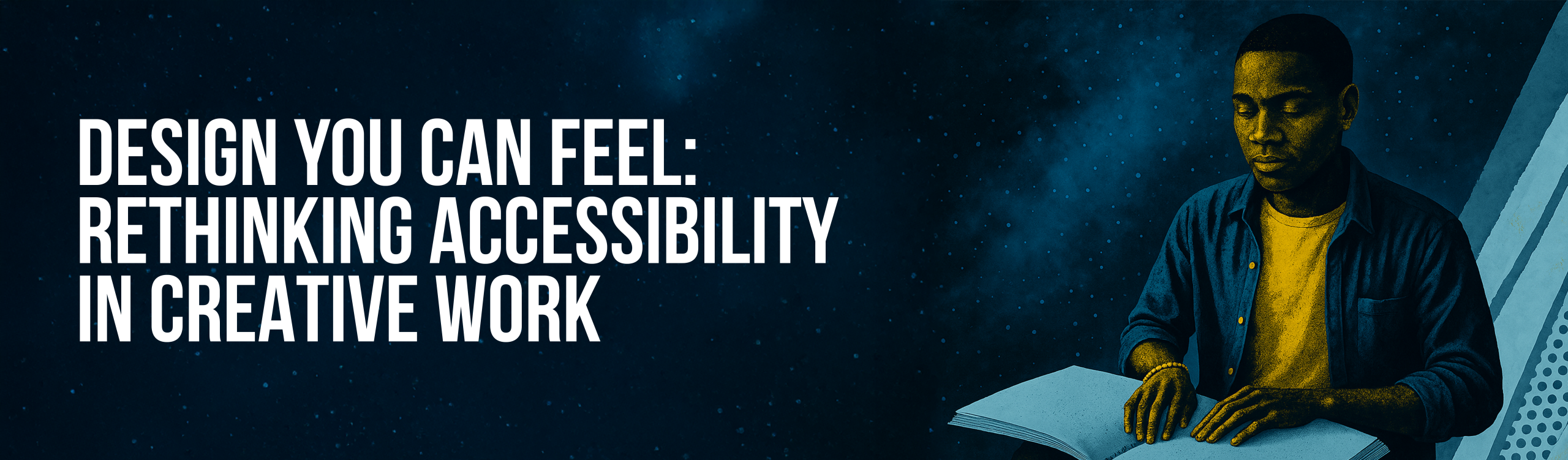
Design you can feel: Rethinking Accessibility in creative work
The best design isn’t always the one you see. It’s the kind you can feel, in texture, rhythm, and flow. It’s how the eye moves across a page, how contrast carries meaning, how space itself becomes communication. World Braille Day reminds us of that truth: that good design isn’t defined by how beautiful it looks, but by how clearly it connects.
Braille is a reminder of what design can do when it centers human experience. It is not a symbol of limitation but of innovation, a language that transformed accessibility into independence. It shows that design at its best adapts to people, not the other way around, and that inclusion begins with empathy translated into form.
When I first designed for an Abilities Advocacy Club in 2016, our goal was to make a set of posters printed in Braille, a piece of communication that could literally be felt and was accessible to all. We had the right intent, but we hit a wall: Braille paper and printing were prohibitively expensive. That moment made something clear to me. The biggest barriers to accessibility aren’t creative; they’re practical. Often, the will is there, but the systems around us make inclusion harder than it should be.
Today, digital tools have made accessibility more achievable than ever. Contrast checkers, colour-blind simulators, screen-reader previews, motion-sensitivity settings, these are simple, often free, ways to make digital work accessible to more people. The more we integrate them into our process, the more natural they become.
That mindset became personal for me when I realised how often red–green contrast appears in everyday design, and how much of it is invisible to people like my partner, who has deuteranopia (green-cone colour blindness). Once you start noticing accessibility gaps, you can’t unsee them. You start designing differently, with more intention, more empathy, and more imagination.
Accessible design isn’t about restriction; it’s about refinement. The same clarity that helps someone with colour blindness helps everyone see your work better. The same hierarchy that supports a screen reader makes for stronger communication overall. When design is inclusive, it’s simply better design.
So on World Braille Day, maybe the call isn’t to do more, but to notice more, to look again at how people engage with what we make. Accessibility doesn’t have to be a separate phase or a specialist task. It’s something we can all start embedding, one thoughtful decision at a time.
Because when creativity becomes something everyone can experience, to see, to hear, to feel, that’s when it does what it was always meant to do.